Detailed designs
Once we got word that our overall design had been approved we began work on resolving the myriad of details that stood between us and parade day. We needed to complete the little design twists that we felt would help make our float stand out, an especially important consideration as many others had far larger budgets to work with.
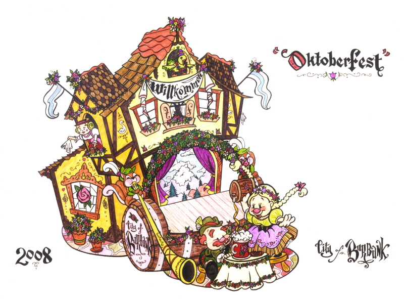
Here's a look at some of the artwork Stacia prepared to help in the color and material choices.
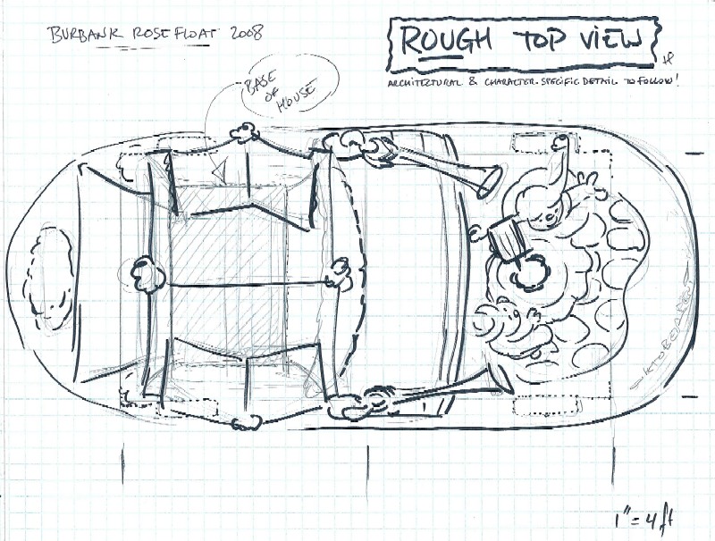
The chassis that holds the engines and wheels can be extended if needed, either by bolting in a new middle section, sort of like adding a section to your dining room table for the holidays, or by extending the front and rear through cantilevered supports. This overhead view helped us figure out how long the whole thing would be.
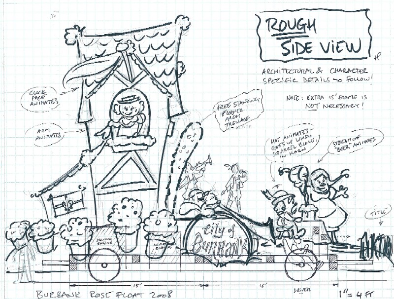
Here's a look at the side that would be facing the TV cameras. We needed to make sure they would get a clear view of the seated figures as well as essential things like the name of our sponsor.
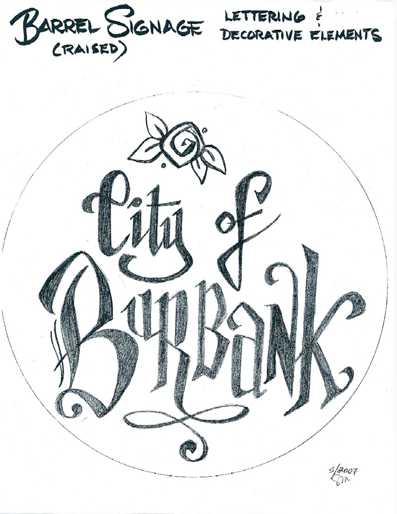
The City of Burbank would clearly be seen as the sponsor, with this decorative lettering on both ends of an over-sized beer keg.
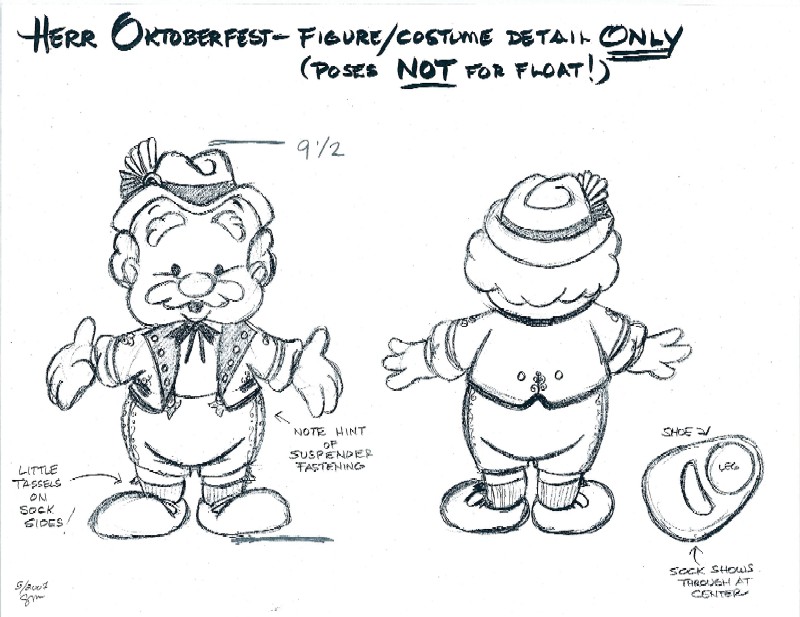
Although our beer drinker would be seen seated at a table, we wanted to visualize his complete outfit and sense of proportions. Stacia made sure she included all sorts of little details like the feathers on his hat and the embroidery on his jacket.
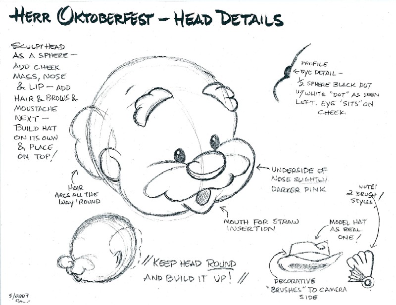
This drawing was used to help the sculptor who would later carve a giant block of foam into the man's head.
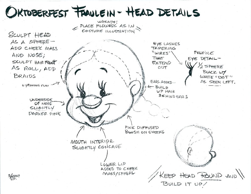
Our happy and helpful waitress got the same attention.
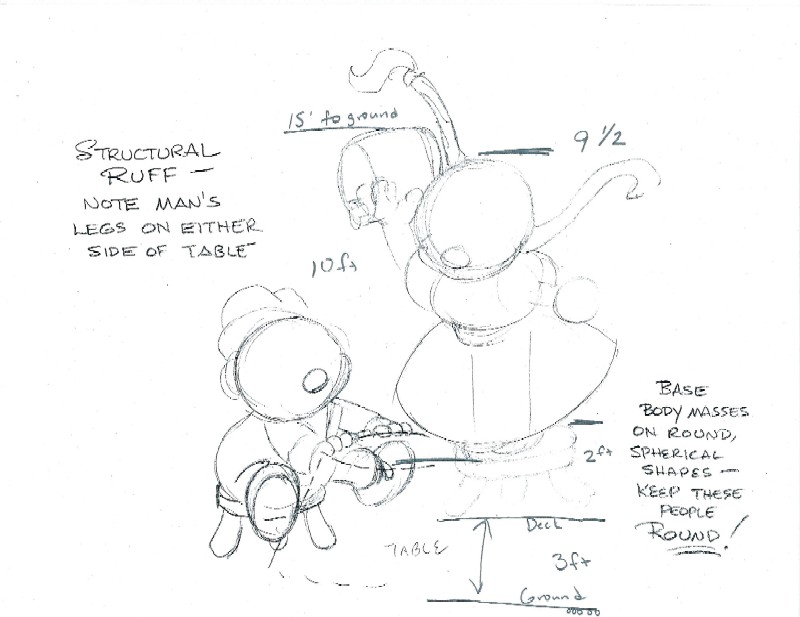
This rough sketch helped establish the size relationship between the characters with a suggestion on how they be positioned in relation to each other.
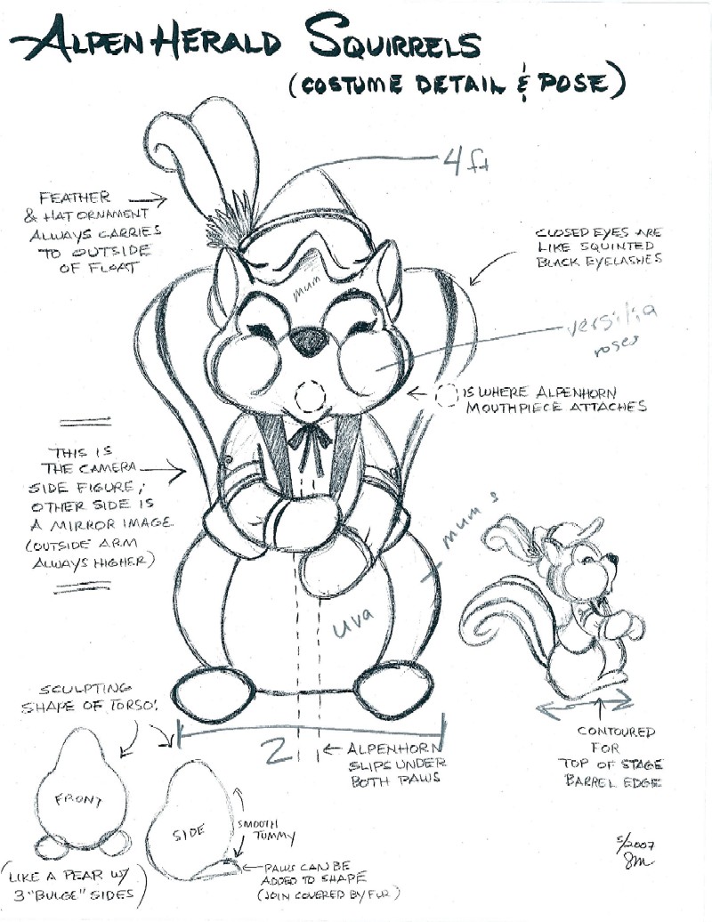
One of these colorful little guys would be on either side of the house, adding a nice comedic touch to that section of the float.
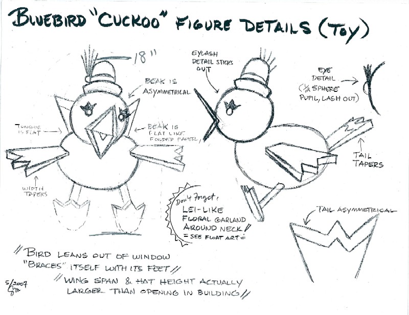
Nothing was left to chance. Even our little cuckoo bird was planned out in detail, allowing us to make sure he would be built to the proper scale, but that we would also have the right amount of flowers to cover him.
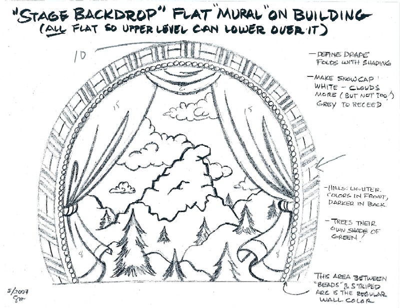
The stage backdrop was an important piece to plan out, as it would take a lot of dry material to provide the level of detail we wanted to make it look like a curtain on a real stage. You might note we finally did figure out a way to get our mountain in the design!
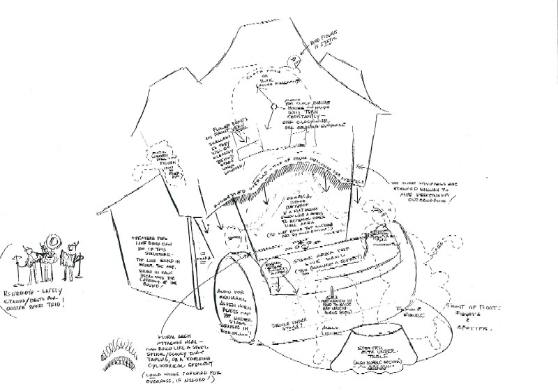
Every year we would try to make the float as tall as possible. Not only does it make the crowd appreciate the float more, but the judges award extra points for creativity here. You could theoretically go as high as you want, but the design has to allow it the float to fit under some bridges along the route.
In this case we needed to find a way to make a two-story chalet squeeze down into the space of a one-story building. We actually built the upper story slightly larger than the ground floor so it could be lowered as needed. It was important that nothing on the walls of the ground floor would protrude and get in the way of the upper walls. This even meant our choice of flowers had to consider this. If a big bushy flower was used on the lower wall it could get sliced off as the walls came down.
How did we actually get the house to shrink and grow on command? That ingenious solution is awaiting on an upcoming page!
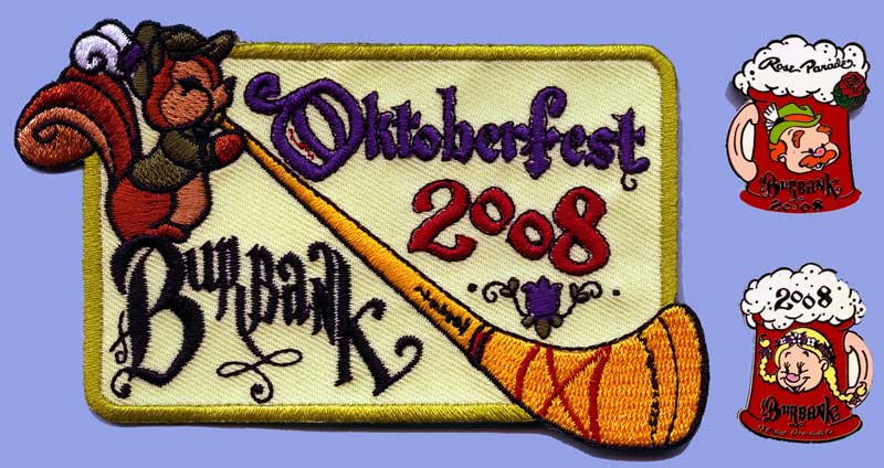
Finally, after using up a mountain of paper on potential designs and color schemes we could begin to build our Alpine fantasyland. Oh, if all this work wasn't enough, Stacia also designed the annual patch and a set of enamel pins that were sold as fundraisers.
